Is Devanagari script going the fusion way? – Firstpost
&w=1200&resize=1200,675&ssl=1 "Is Devanagari script going the fusion way? – Firstpost")
India is experiencing a cultural revival, with Hindi typography transforming from a simple tool into a symbol of pride, creativity and heritage, showcasing a nation confidently embracing its roots
read more
India is going through something of a cultural renaissance with more and more modern Indians rediscovering pride in the country’s rich heritage and expansive history. For decades, the shadow of British colonial rule left many of us grappling with a loss of identity as our own culture seemed to be sidelined in favour of foreign influences and the ever-growing allure of the West. But there is now a burgeoning move toward embracing our roots and looking inward reflected in an evolving landscape of design, especially in the world of typography.
On the occasion of World Hindi Day, let us acknowledge and celebrate the fact that one of the most notable shifts we’ve seen in the recent past is the resurgence of Hindi typography.
Despite being the most widely spoken language in the country, Hindi was once considered less prestigious than English, perceived as utilitarian and common, and consequently relegated to mass markets.
Today however, Hindi typography is celebrated for its distinctiveness, elegance and cultural flavour, with designers modernising Devanagari fonts to reflect both heritage and contemporary sensibilities and positioning it as a mark of premium quality and indeed, selfhood.
A fusion of scripts
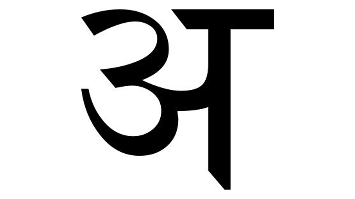
One key trend is the fusion of Devanagari with other scripts, such as Latin, to create distinctive brand identities and a more culturally rooted visual language. Ziaho Chocolates, for example, used regional typography from various Indian states to highlight the origin of the ingredients used, blending it with Latin script to form a unique visual identity. This combination reflects India’s diverse culture while appealing to global audiences, as well as driving home the importance of sourcing locally.
Breaking boundaries
In Maharashtra, it is now mandatory for brands to feature their names in Hindi or Marathi on packaging, but designers are pushing the envelope by moving away from default fonts and reimagining brand identities in Devanagari, calling attention to Indian pride with contemporary elegance and flair.
It’s a remarkable development that brands are no longer content with simply meeting regulatory standards as required, instead tapping into their creativity and using typography as a tool for innovation and cultural expression.
Regional reawakening
Rather than following global trends or taking a route already formed in Western markets, designers are consciously choosing to draw inspiration from local scripts and traditional motifs. In this way, regional typography builds originality in design and creates authentic, unique visual languages.
This approach not only distinguishes brands and reinforces their individuality, but also ensures that their designs resonate deeply with the Indian audience and are as timeless as the scripts and typographical characters that we have all grown up with.
A shift in sentiment
The rise of these design practices reflects a broader cultural shift within India, one that has been a long time in the making. The use of Hindi typography in increasingly innovative ways is a powerful symbol, a manifestation even, of India’s growing confidence and pride in its own culture and heritage.
We are no longer looking to the West for validation, nor are we relying on foreign influences but are proudly drawing on India’s rich cultural traditions to create modern, distinctive identities. This embrace of Hindi typography is not just about aesthetics; it’s about cultural authenticity.
Hindi typography has evolved from a simple tool for communication into a powerful statement of India’s identity. While we have already seen this in the fields of art, fashion, legacy media and pop culture, it’s refreshing to witness it taking shape in branding, packaging and digital media. That it is now used with sophistication, artistry and pride is a testament to how far we have come in accepting, embracing and finally celebrating who we are, reflecting a modern, confident India that is reclaiming its cultural legacy.
Krupa Sheth Kapadia is the Co-Founder and Creative Director at the branding and design agency Stratedgy. Views expressed in the above piece are personal and solely those of the author. They do not necessarily reflect Firstpost’s views.
&w=1200&resize=1200,675&ssl=1 "Why Dalai Lama’s succession is Bharat’s strategic imperative and moral duty – Firstpost")
&w=1200&resize=1200,675&ssl=1 "Can India navigate the global trade storm? – Firstpost")
&w=1200&resize=1200,675&ssl=1 "Can IMEC do what the Abraham Accords couldn’t—deliver peace? – Firstpost")


Post Comment